Autocomplete component
Out there are so many ways to create an Autocomplete and, you'll face several scenarios of it along your career as "frontender". Here I wanna post some thoughts about this component and, how to code it without adding extra dependencies, I suppose your stack is: React (with Typescript) and, Tailwind. The idea of this post is help us to think how to create a component.
What is an Autocomplete component?
In essential it's an interactive input, while the the user is writing text in input box, a list of "coincidences" is displayed below (or above) the input element.
Breaking down the component
Once understood the concepts listed above, we can implement something quickly to fully see what this component give to us:
We gonna have 2 main components: the input and the list of coincidences, for the first we have to use the Controlled Component pattern, and the idea is to be agnostic of the data source, so our component will be a Controlled Component.

const AutocompleteDemo = () => {
  const [displayOptions, setDisplayOptions] = useState(false)

  return (
    <div>
      <input
        className="w-full"
        onFocus={() => {
          setDisplayOptions(true)
        }}
        onBlur={() => {
          setDisplayOptions(false)
        }}
      />
      {displayOptions && (
        <div className="relative mt-4">
          <div className="absolute w-full">
            <ol>
              {[1, 2, 3, 4, 5, 6].map((numb) => {
                return (
                  <li className="w-full bg-slate-800" key={numb}>
                    {numb}
                  </li>
                )
              })}
            </ol>
          </div>
        </div>
      )}
    </div>
  )
}
Basic component API
Let's define an API to interact with, reading the definition above, something like:
interface AutocompleteProps<TOptions> {
  // the coincidences
  options: TOptions[];
  onInputChange: (e: React.ChangeEvent<HTMLInputElement>) => void;
  onSelectOption: (option: TOption) => void;
  className?: string;
}
Components structure
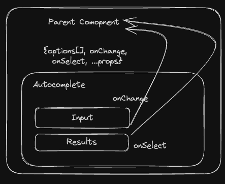
In this implementation the parent component will provide all filtered options, and the Autocomplete will pass the data through callbacks to the parent.
So component tree will be like:

The component API
Let's define an API to interact with, reading the definition above, something like:
interface AutocompleteProps<TOptions> {
  options: TOptions[];
  onInputChange: (e: React.ChangeEvent<HTMLInputElement>) => void;
  onSelect: (option: TOption) => void;
  className?: string;
}
These are the most basic props to create an Autocomplete, once it gets working you'll be able to enhance the implementation.
The Parent
The next thing we gonna do is define the Parent component.
const Parent = () => {
  const [inputValue, setInputValue] = useState<string>()
  const [selectedOption, setSelectedOption] = useState()

  // get the data from somewhere
  const { data } = useGetData()

  const onSelectOption = (options) => {
    setSelectedOption(option)
  }

  return (
    <>
      <h1>Selected Value: </h1>
      <span>{JSON.stringify(selectedOption)}</span>

      <Autocomplete
        options={data}
        onChangeInput={setInputValue}
        onSelect={onSelectOption}
      />
    </>
  )
}
Easy! right? Now collecting all of these definitions we can actually code our Autocomplete (finally!).
The Autocomplete Key
The Autocomplete has 2 base elements, an input and a list of results, and 1 UX constrain, the list must not push down the content below 👍.
To address that constrain we gonna use position relative and position absolute like following:
{/* Render the list of coincidences */}
<div className="relative">
  {isOpen ? (
    <ol className="absolute top-0">
    ...
By doing that, we fix that the position of the options list. Now wrapping the input and the options with an element to set the width.
const Autocomplete = <TOption>({
  options,
  onInputChange,
  onSelect,
}: AutocompleteProps) => {
  const [isOpen, setIsOpen] = useState(false);

  const handleKeyDown: KeyboardEventHandler<HTMLDivElement> = (event) => {
    setIsOpen(true);
  }
  const onBlurHandler = () => setIsOpen(false);

  return (
    <div className={className}>
      <input
        onChange={onInputChange}
        onFocus={onFocusHandler}
        onBlur={onBlurHandler}
      />

      {/* this is KEY! */}
      <div className="relative mt-1">
        {isOpen ? (
          <ol className="absolute top-0 animate-in fade-in-0 fade-out-0">
            {options?.map((opt, idx) => {
              return (
                <li
                  onClick={() => {
                    setIsOpen(false)
                    onSelect(opt)
                  }}
                >
                {/* Render the element */ }
                  Element {idx}
                </li>
              )
            })}
          </ol>
        ) : null}
      </div>
    </div>
  )
}
For me, the key to understand how to code this component in the future is the position of the list of options using the positions relative and absolute. It's obvious that there are many other things to take into account and, libraries, like MateriaUI, provide full Autocomplete implementations, but using these UI libraries may lead you to not think about details.
Conclusion
With this way of thinking we can scale our implementation to something as complex as wanted, like adding Loading and Empty states, select elements using arrow keys, etc.
The "coincidences" we talked before are elements that matches somehow with the input text, I prefer to filter the elements outside of the Autocomplete component to avoid coupling the concepts and, the parent can use the selected value as it desires, fetch the data from anywhere and, having a controlled AUtocomplete component you will be able to control the input value.
From this point of view, there are not many differences between an Autocomplete and a Dropdown component.
Hope this help you! 🙂